
harshpreet-hand
I gave Claude Code 120 pages of my handwritten college notes. It gave me back my handwriting as a real font, in 66 minutes for $13.68.
Install with your AI
Paste into Claude Code, Cursor, or any agent — it reads the repo and wires the tool into your project.
Install and set up harshpreet-hand (release-binary project) into my current project.
Found on https://claudeers.com/harshpreet-hand
Repo: https://github.com/harshpreet931/harshpreet-hand
Homepage/docs: https://harshpreet931.github.io/harshpreet-hand/
Detected install method: release-binary → inspect the README
Category: productivity. Platforms: api, web.
Read the repo's README for exact setup and env vars, then install it and wire it into my project.

Claudeers Health Verdict:
active; community-verified: false. Confirm the source before running anything.
Grab the latest release asset from GitHub.
# download a build from https://github.com/harshpreet931/harshpreet-hand/releases
git clone https://github.com/harshpreet931/harshpreet-hand
// compatibility
| Platforms | api, web |
|---|---|
| Operating systems | — |
| AI compatibility | claude |
| License | MIT |
| Pricing | open-source |
| Language | Python |
Harshpreet Hand
I gave Claude Code 120 pages of my handwritten college notes.
It gave me back my handwriting, as a real font.
One prompt · 1 h 06 min · $13.68 in API calls
Type in it → · Download · Use it in one line · How it was made · Make your own
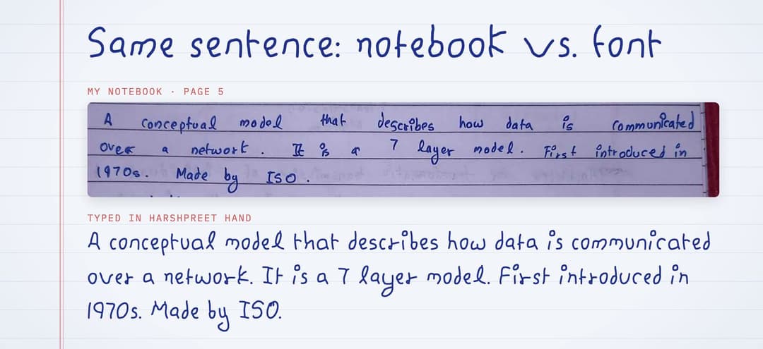
Every letter comes from the notes: it was found in the page photos, then redrawn along the pen's path with one steady ballpoint nib. Each letter has 2–3 real variants from different pages that rotate as you type, so doubled letters never look stamped.
Watch it get built
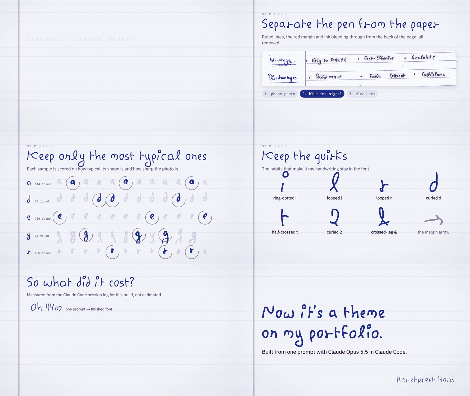
2x speed. Full 65-second video (MP4). Every frame is real pipeline output, made with Remotion in video/.
Use it in one line
<link rel="stylesheet" href="https://cdn.jsdelivr.net/gh/harshpreet931/[email protected]/dist/harshpreet-hand.css">
<style>
  body { font-family: "Harshpreet Hand", cursive; line-height: 1.6; }
</style>
Or install it on your computer for Figma, Keynote, Word and the rest: grab
HarshpreetHand-Regular.ttf and -Bold.ttf from the
latest release.
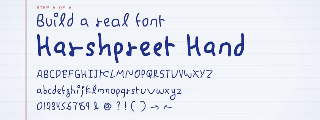
What's in dist/
| File | Use |
|---|---|
HarshpreetHand-Regular.woff2 / -Bold.woff2 | Web (use these) |
HarshpreetHand-Regular.woff / -Bold.woff | Web fallback for very old browsers |
HarshpreetHand-Regular.ttf / -Bold.ttf | Install on your computer (Figma, Keynote, …) |
harshpreet-hand.css | @font-face rules + a ready data-theme="handwritten" theme |
specimen.html | Specimen and type tester (live version) |
notes-sample.jpg | Crop of the original notes, used by the specimen |
Add it to a site as a theme
- Copy the
.woff2(and optionally.woff) files into the site, e.g.public/fonts/. - Copy
harshpreet-hand.cssnext to them (or paste its rules into your global CSS) and fix theurl()paths if needed. - Turn the theme on:
document.documentElement.dataset.theme = "handwritten".
[data-theme="handwritten"] {
  font-family: "Harshpreet Hand", "Segoe Print", cursive;
  font-size: 1.15em;   /* x-height is 0.44 em, a bit smaller than UI fonts */
  line-height: 1.6;    /* room for the long g / y loops */
  font-feature-settings: "calt" 1, "kern" 1;
}
Tips:
- Keep
line-heightat 1.5 or more. The g and y loops go deep, just like in the notes. - Use it for headings and prose. Keep code, tables and dense UI in your normal fonts.
The theme CSS already does this for
code/pre. - Optional classes in the CSS:
.notebookadds ruled paper with a red margin line,.notebook-spacingadds the wide word gaps from the notes, and.plain-rswitches to the plain r.
Features
calt(on by default): every letter and most figures have 2–3 real variants from different pages. The font rotates through them as you type, sohello→ h, e², l³, l¹, o² and doubled letters never look stamped. Each variant also sits slightly higher or lower than the others, like real handwriting.ss01: a plain r without the little loop at its foot.kern: kerning computed from the letter outlines (e.g.To,Ty,r.).- Coverage: A–Z, a–z, 0–9, ASCII punctuation, curly quotes, dashes,
… • · ° × ÷, arrows→ ← ↑ ↓(taken from the arrows in the notes' margins), and Western European accents.
Quirks it keeps
Ring-dotted i/j · looped l · r with a small loop at its foot · curled d · t crossed on the right only · curl-footed 2 · the crossed-leg & · hook-headed → · the rounded W with a tall first stroke · the barred I.
How it was made
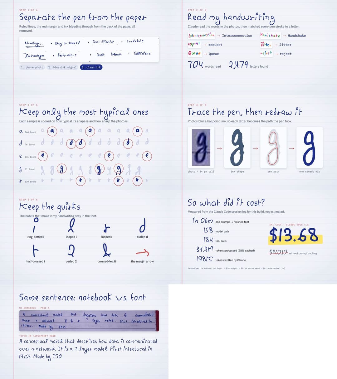
The source is CN_CompleteNotes_FullSyllabus.pdf:
120 phone photos of my Computer Networks notes, covering the full syllabus. (If
you're studying CN, they're yours to read too.)
| Step | Script (pipeline/) | What it does |
|---|---|---|
| 1 | render_pages.py | Renders the PDF pages to images |
| 2 | ink.py, segment.py, segment_all.py | Separates the blue ink from the paper, ruled lines, red margin and back-page bleed-through, then splits pages into words and letter groups |
| 3 | labels/*.txt | Transcriptions of 704 words by word id (12: packets, {0:W} to assign one group directly, \? for a literal ?) |
| 4 | harvest.py | Matches transcriptions to letter groups. Where letters touch, a dynamic-programming alignment recovers the single letters. Output: 2,479 samples normalized to baseline and x-height |
| 5 | select_samples.py | Ranks each letter's samples by typicality and photo sharpness |
| 6 | candidates.py, strokes.py | Skeleton → pen centerline graph → smoothing (strokes joined through crossings) |
| 7 | design/picks.json, design.py, construct.py | The chosen variants, height normalization, and letters built from parts of the hand (G, J, X, most punctuation, accents, ← ↑ ↓) |
| 8 | build_font.py | Round-nib rendering → potrace → TrueType, metrics, calt/ss01/kern, WOFF/WOFF2 |
| – | verify.py, preview.py, grid.py, make_specimen.py | Checks (HarfBuzz + FreeType) and the specimen page |
What it cost
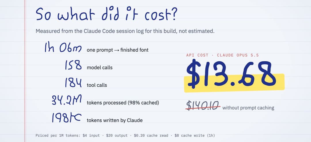
Measured, not estimated: pipeline/session_stats.py
totals the usage blocks in the Claude Code session log and prices them at
Claude Opus 5.5 API rates. Prompt caching is what kept it at $13.68 instead of $140.
Rebuild it
brew install potrace                      # or: apt install potrace
python3 -m pip install -r requirements.txt
pipeline/run_all.sh                       # ≈10 min; intermediates go to work/
pipeline/run_all.sh font                  # only the font, after tweaking spacing or weight
Things you can tweak in pipeline/build_font.py:
WEIGHTS: nib size per weight (penis a fraction of the x-height; Regular 0.13, Bold 0.20). Add aLightentry for a third weight.SB/SPACE: letter and word spacing.FAMILY/PS_FAMILY: the font's name.
To swap a variant, change its source [page, word id, group] in design/picks.json
(python3 candidates.py abc out.png shows the numbered candidates), then run run_all.sh.
Make one from your own handwriting
The pipeline is tuned to these notes (blue ballpoint on ruled paper, shot on a phone), but every step is a plain script and every choice specific to my hand lives in a file you can edit:
- Put photos of your pages into one PDF. Blue ink on ruled paper works as is;
for other inks, adjust the colour model in
pipeline/ink.py. cd pipeline && python3 render_pages.py ~/my-notes.pdf && python3 segment_all.pysplits every page into words.python3 segment.py 4 13 38then draws numbered contact sheets for those pages (work/seg/sheet_p004_0.png, …).- Replace
labels/*.txtwith your own transcriptions (labels/p004.txtfor page 4), oneid: wordline per word. About 700 words gave me 2–3 good variants of most letters. python3 harvest.py && python3 select_samples.py, then choose your variants indesign/picks.json(python3 candidates.py abc out.pngshows the candidates).- Set
FAMILY/PS_FAMILYand the name strings inbuild_font.py, thenpython3 design.py && ./run_all.sh font.
construct.py builds G, J, X and most punctuation from parts of my letters, so
check those against your hand. The shortcut is the way this one was made: open
the repo in Claude Code next to your PDF and
ask it to adapt the pipeline to your handwriting.
Limitations
- A few capitals (V, W, Z) had only one clean sample in the notes, so they have one variant.
- G, J, X and most punctuation were built from other parts of the hand rather than traced directly.
- No hinting: it renders well at normal web sizes on modern browsers, but it isn't tuned for tiny text on old Windows ClearType.
License
- Fonts (
dist/*.ttf,*.woff,*.woff2) and glyph data (design/): SIL Open Font License 1.1. Use, embed and ship them in personal or commercial work; you can't sell the font on its own. - Code (
pipeline/,video/): MIT. - Notes and images (
CN_CompleteNotes_FullSyllabus.pdf,assets/): CC BY 4.0.
If you make something with it, or a font from your own handwriting, I'd love to see it. Open an issue or tag me.
// faq
What is harshpreet-hand?
I gave Claude Code 120 pages of my handwritten college notes. It gave me back my handwriting as a real font, in 66 minutes for $13.68.. It is open-source on GitHub.
Is harshpreet-hand free to use?
harshpreet-hand is open-source under the MIT license, so it is free to use.
What category does harshpreet-hand belong to?
harshpreet-hand is listed under productivity in the Claudeers registry of Claude-compatible tools.
// embed badge

[](https://claudeers.com/harshpreet-hand)
// retro hit counter

[](https://claudeers.com/harshpreet-hand)
// reviews
// guestbook
// related in Productivity
 🔓
Agent skills for Obsidian. Teach your agent to use Obsidian CLI and open formats including Markdown, Bases, JSON Canvas.
 🔓
Open source repository of plugins primarily intended for knowledge workers to use in Claude Cowork
 🔓
Garry's Opinionated OpenClaw/Hermes Agent Brain
 🔓
An open-source alternative to Claude Cowork (powered by opencode)