
oxfords
UI/UX skill for Claude Code, Codex and Cursor. Polished, plain interfaces with no AI slop. Includes a zero-dependency slop checker.
Install with your AI
Paste into Claude Code, Cursor, or any agent — it reads the repo and wires the tool into your project.
Install and set up oxfords (release-binary project) into my current project.
Found on https://claudeers.com/oxfords
Repo: https://github.com/arhamhi/oxfords
Homepage/docs: —
Detected install method: release-binary → inspect the README
Category: skills. Platforms: cli, api, desktop, mobile.
Read the repo's README for exact setup and env vars, then install it and wire it into my project.

Claudeers Health Verdict:
active; community-verified: false. Confirm the source before running anything.
Grab the latest release asset from GitHub.
# download a build from https://github.com/arhamhi/oxfords/releases
git clone https://github.com/arhamhi/oxfords
// compatibility
| Platforms | cli, api, desktop, mobile |
|---|---|
| Operating systems | — |
| AI compatibility | claude |
| License | MIT |
| Pricing | open-source |
| Language | JavaScript |

Your AI builds UIs that look like someone actually finished them.
A UI/UX skill for Claude Code, Codex and Cursor. Polished, plain, no AI slop.
Oxfords, not brogues. An Oxford is the plain shoe, and a brogue is the same shoe with a bunch of decoration punched into it.
So this skill won't make your site look insane, and it won't give you crazy animations. There are good skills for that already. What I wanted was the boring part done properly: a screen that's clear, that's finished, and that doesn't have the stuff on it that tells everyone an AI made it.

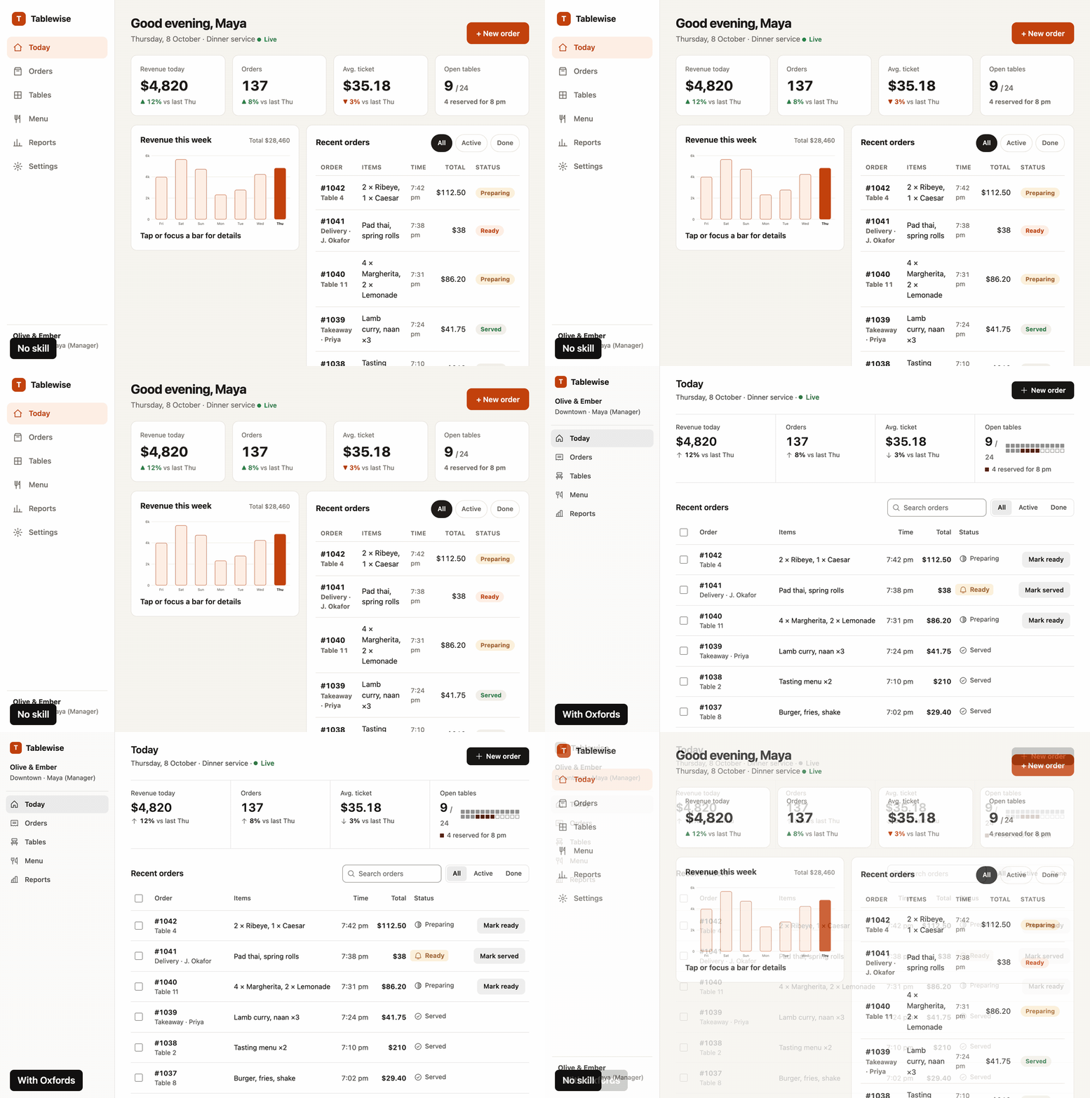
A dashboard built with no skill, then redesigned with Oxfords. Same data, same labels, same links.
What you get
The half that gets skipped. AI builds the happy path and then stops. Oxfords makes it keep going, so you get the button states, the feedback when you click something, the empty screen, the error screen, what happens with a really long name or 10,000 rows, keyboard focus, and tap targets that work on a phone.
A screen you can actually scan. Nobody reads a UI. You land on it with one question and you hunt for the answer. So Oxfords lines things up on edges, lets the data decide what component to use, and makes one thing on the screen important instead of all of it.
No AI slop. I kept seeing the same tells in everything AI builds, even with good design skills loaded, so there's a strict list of them and what to use instead:
| Out | In |
|---|---|
| A coloured bar down the side of the active nav item | A full-row fill |
| A card around everything, cards inside cards | Space, alignment, one hairline |
| A small uppercase label above every heading | The heading |
| Inter, Geist, Poppins, Instrument Serif, Playfair | The system font, or a face you can give a reason for |
| Emoji as icons, the stock icon set at default stroke | One icon set, one weight, matched to the text |
| Bone and orange, white and blue, purple gradients | A palette chosen for the product, with a reason |
| Gradient text, glows | Flat colour, and each colour does one job |
| A tinted pill on every status | Colour only where something needs attention |
| Bounce, fade-up on everything, pulsing dots | Short ease-out transitions that explain a change |
| "Seamless", "Get started", Acme, 99.9% | The plain sentence and believable data |
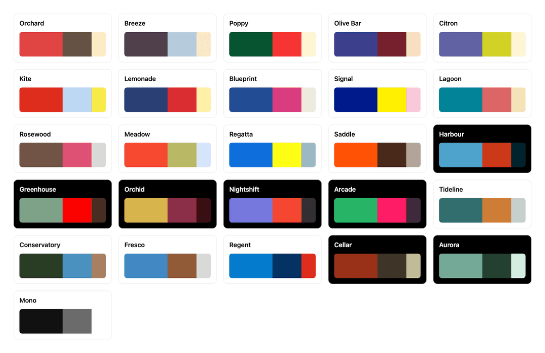
Colours somebody actually picked. You've probably noticed Claude goes for the same bone background with an orange accent on pretty much everything now. Before that it was purple gradients, and if you tell it to be "clean" you get white, grey and one blue button. They're all the same problem, the colour got picked by default. So Oxfords comes with 26 palettes, three colours each, and the agent has to choose one for your product and say why. The palette goes on top of proper neutrals though, white, black and greys still do most of the work, so you don't end up with a page that's cream from edge to edge.
And the agent doesn't type colours by hand anymore. A script turns the palette into every colour the page needs: the hover and pressed shades, a version of each colour that's actually readable as text, three levels of grey for text, red for delete that never gets mixed up with your brand, and a dark mode that's designed instead of just flipped. Every pair is contrast checked before it's written. Got a client colour? Give it that and it builds the rest around it.
node skills/oxfords/scripts/palette.mjs Tideline --mode both
node skills/oxfords/scripts/palette.mjs --brand "#FF8A3D"
Checkers, so it's not just vibes. The first one reads your code, no dependencies:
node skills/oxfords/scripts/check.mjs ./src
src/components/Sidebar.tsx
  FAIL  accent-rail          coloured bar on the side of an element; use a full fill or nothing  (line 42)
        border-left: 3px solid
  FAIL  default-font         default font nobody chose; use the system stack or a face with a stated reason  (line 7)
  WARN  viewport-100vh       100vh jumps on phones; use dvh or svh  (line 18)

1 file, 2 fail, 1 warn
It exits with an error when something fails, so you can put it in CI or a pre-commit hook.
The second one actually opens the page. It renders it on a phone width and a desktop width, in light and dark, saves the screenshots, and measures the stuff you can't see in code: text that fails contrast, text that's clipped or overlapping, sideways scrolling, focus you can't see, buttons too small to tap, and how much of the screen is colour. It needs Playwright, and if you don't have it, it tells you and gets out of the way.
node skills/oxfords/scripts/shoot.mjs ./dist/index.html
Install
Claude Code, Codex and other agents that read skills
npx skills add arhamhi/oxfords
Or copy skills/oxfords into your skills folder (~/.claude/skills/ for Claude Code,
~/.agents/skills/ for Codex and others).
Cursor
Copy skills/oxfords into your project and adapters/cursor/oxfords.mdc into
.cursor/rules/.
Anything that reads AGENTS.md
Copy skills/oxfords into your project and paste adapters/AGENTS.md into your AGENTS.md.
Use
You don't have to do anything special. Ask for UI work the way you already do and the skill loads when the task is a UI.
Build the orders dashboard.
Review this settings page with oxfords.
This looks AI-generated. Fix it.
It works in four modes:
| Mode | What happens |
|---|---|
| Build | Reads the brief, works a twelve-step build order from intent to finished states, measures the result and fills a done gate |
| Redesign | Writes down what has to stay first (links, labels, fields, data), then redesigns, then proves nothing went missing |
| Review | Looks at the screenshots first, measures second, reports each finding as symptom, fix and reason |
| Fix | Changes only what a finding names and leaves your copy and identity alone |
What is inside
skills/oxfords/
  SKILL.md                       build order, done gate, slop floor, numbers
  references/
    app-ui.md                    dashboards, tables, charts, settings
    mobile.md                    app screens, navigation, sheets, gestures
    landing.md                   message, structure, what to leave out
    redesign.md                  what to keep, what to change, in what order
    states-forms-copy.md         every state, forms, errors, copy, accessibility
    colour.md                    neutrals, palettes, states, dark mode, client colours
    slop-floor.md                the full ban list with replacements
    motion.md                    timing, easing, gestures, reduced motion
    review.md                    fresh eyes, the two passes, severity, when to stop
  scripts/
    palette.mjs                  turns a palette into every colour token, contrast checked
    palettes.json                the 26 palettes
    check.mjs                    the slop checker, reads code
    shoot.mjs                    the render check, opens the page and measures it
    keep.mjs                     checks a redesign kept every link, label and field
The main file is short on purpose. Your agent reads it every time, and only opens a reference file for the thing it's actually building.
What Oxfords is not
- It won't replace your brand. If your project already has colours or a design system, those win. The palettes are for when you've got nothing.
- It won't give you a look. If you want a landing page with a signature animation, use a design skill built for that and let Oxfords check the result after.
- It can't see everything. The render check measures contrast, clipping and focus, but it can't tell you've put a card inside a card or a button that does nothing. Those are on a short list you check by eye.
One thing I had to be careful with: plain doesn't mean empty. If you strip all the slop out and add nothing, you get a grey page with one accent colour, and that's just a different kind of generic. So Oxfords asks for real content, one clear thing to look at first, and choices you can give a reason for.
How it was tested
I froze a copy of v1 and a copy of v2, wrote four briefs that each push on something different, and had the same model build every brief twice, once with each version. The briefs are a dark dispatch board for an HVAC company, a landing page that has to use a client's orange, a settings screen in light and dark, and a redesign of an existing screen that has to keep its labels and links.
Then a fresh judge on a different model got the brief and the screenshots and nothing else. The two builds were labelled X and Y in a random order, it scored seven things out of 5 and picked one. I only unblinded once all four had answered.
                      judge picked   points, v1 / v2     checker warnings, v1 / v2
dispatch board        v2             19 / 28             6 / 0
landing page          v1             29 / 23             0 / 0
workspace settings    v2             27 / 29             42 / 0
redesign              v2             24 / 29             1 / 0
v2 won three out of four, and every judge that picked it gave colour as a reason: states that mean something, the client's brand kept as the brand, delete in red. The landing page went to v1 and the judge was right. The v2 build put a muddy brown card where the price lives and built the hero like an app with tabs and a chart, when v1 just showed the report the clinic actually gets. The brown was a bug in the colour engine and that's fixed. Everything else the judges flagged, on either side, is a rule in the skill now.
That's 22 rule changes I haven't re-run yet, so treat this as one round. One judge per brief, one judge model, four briefs, and 29 to 27 on settings is close to a coin flip. One judge also said a link failed contrast when it measures 5.18:1, so the judges get things wrong too.
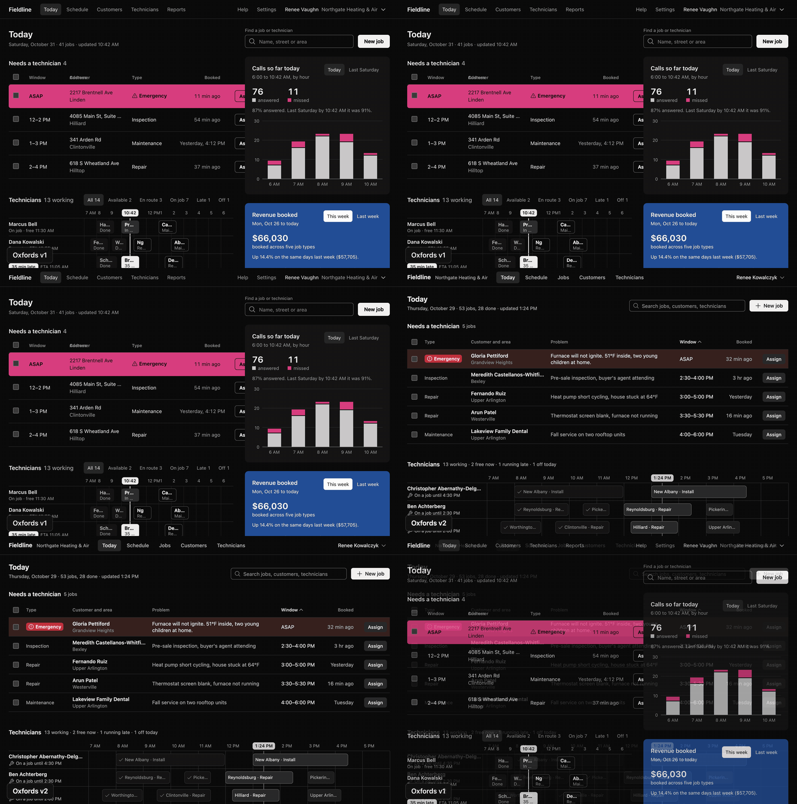
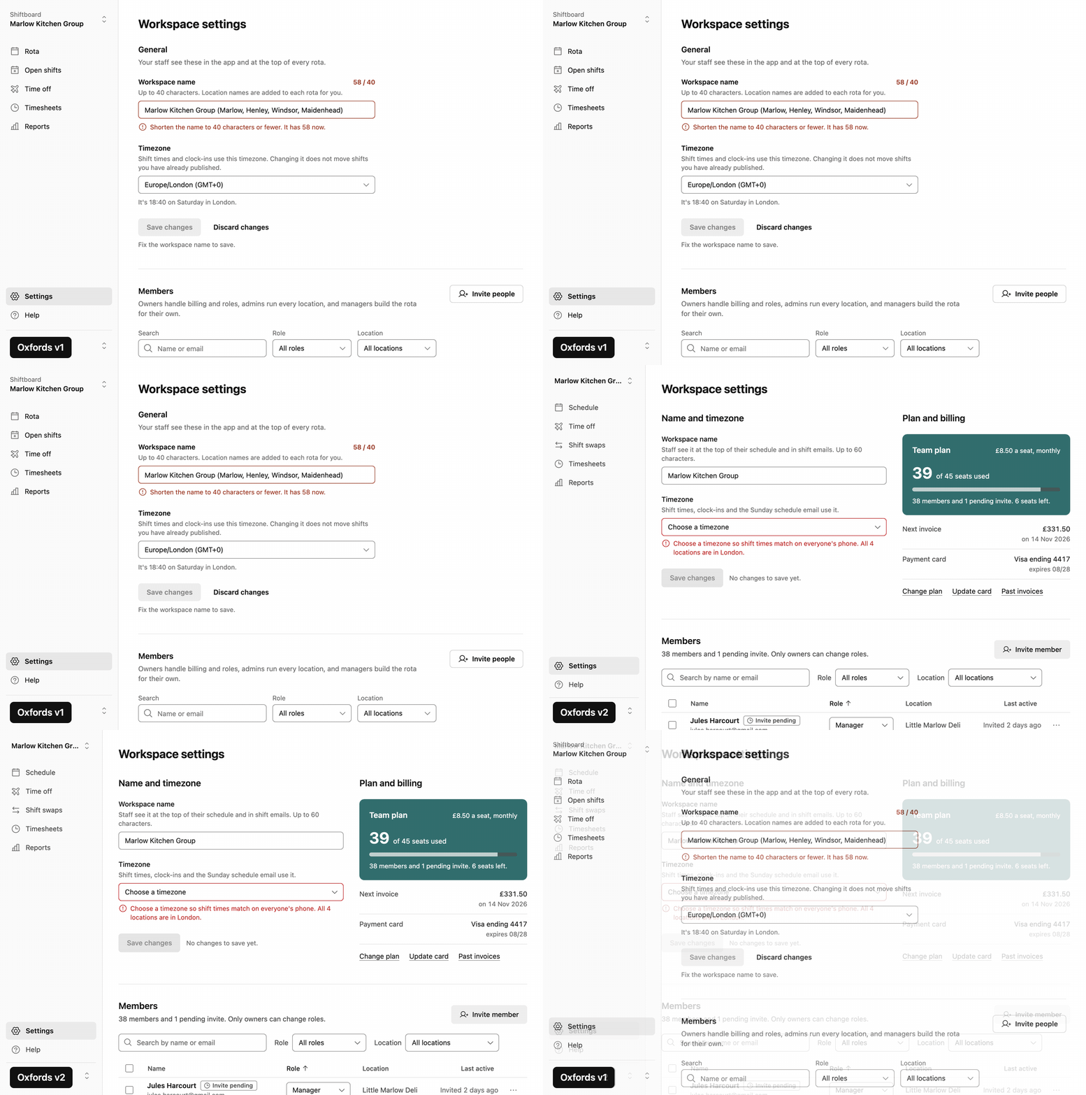
Every brief and both builds of it are in docs/test-run (old.html is v1,
new.html is v2), so you can run the checkers on them yourself:
node skills/oxfords/scripts/check.mjs docs/test-run/settings/old.html
node skills/oxfords/scripts/shoot.mjs docs/test-run/settings/old.html

Credits
I didn't come up with most of this. The usability side I learned from Kole Jain's videos, and you should watch them. I also studied impeccable by Paul Bakaus, taste-skill by Leonxlnx, and apple-design by Emil Kowalski, and took ideas from each. Everything here is written in my own words, and what came from where is in CREDITS.md.
The paintings in this repo were made in code, stroke by stroke. They're all in art.
Licence
MIT. See LICENSE.
// faq
What is oxfords?
UI/UX skill for Claude Code, Codex and Cursor. Polished, plain interfaces with no AI slop. Includes a zero-dependency slop checker.. It is open-source on GitHub.
Is oxfords free to use?
oxfords is open-source under the MIT license, so it is free to use.
What category does oxfords belong to?
oxfords is listed under skills in the Claudeers registry of Claude-compatible tools.
// embed badge

[](https://claudeers.com/oxfords)
// retro hit counter

[](https://claudeers.com/oxfords)
// reviews
// guestbook
// related in Claude Skills
 🔓
An agentic skills framework & software development methodology that works.
 🔓
 🔓
AI coding assistant skill (Claude Code, Codex, OpenCode, Cursor, Gemini CLI, and more). Turn any folder of code, SQL schemas, R scripts, shell scripts, docs,…
 🔓
💫 Toolkit to help you get started with Spec-Driven Development